When it comes to everything in the world of fashion and design, specific color choices can sometimes be overlooked and given less credit than they are due by consumers at large, while color remains as the backbone of the design industry. Color choices and color configuration is what can make or break any design effort, and there’s a lot more to understanding and selecting colors that makes it highly essential for consumers to turn to the wisdom of design pros within any segment of fashion.
Duality Presented as One: Pantone’s Color of the Year Leads the Winter Way
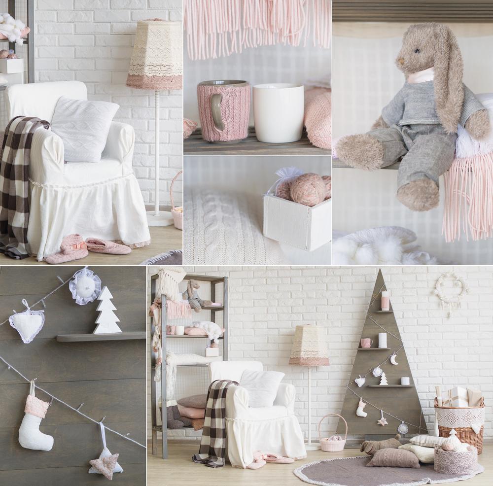
Because of color’s interpretive complexity, it’s reassuring to have the sage advice of color pros, who keep us in the know. At the exclusive top of the color industry association, there’s Pantone, who recently announced the 2016 Color of the Year, which is really a misnomer, being a pairing of two colors, not one. This challenge to color association is thought to have emerged from the global direction of gender blurring, particularly as it relates to fashion, and it has certainly affected design world color trends. The trending colors have become a reflection of the times, when the digital age is revealing new, fresh approaches to color usage, and enabling us to shed concern for stereotypes and previous colors that have been restricted from full use on the basis of gender. So the Color of the Year 2016 is Rose Quartz and Serenity, promised to induce calm and relaxation and offers the assurance of joining easily with many other mid-tones and pastels. This “color” accepts silver and hot brights with rich pizazz and sparkle.
The Color of Winter 2016
Sophistication turns to a multi-dimensional androgynous direction this winter, across the board, giving us for the first time a unisex color palette. Think warmth, protection and creativity melding with nature in honor of everything bohemian to modernist, with juxtaposing opposite ends of the color spectrum to form unprecedented vitality that transcends gender distinctions. This winter’s new neutral is Desert Sage, a smooth, grey-green that exudes natural inspiration and a cool timelessness. The assuring comfort of golden tones added to yellow ones makes Oak Buff be a nice, cheerfully connective accent color. With just enough blue to reveal more than flat gray, this year’s Stormy Weather offers long enduring strength with timeless luxury. Dried Herb takes up where traditional olive green left off, doing wonderfully in numerous pairings. And a move to Marsala was certainly due, with so many elements of life and fashion celebrating this lovely blending of soft brown and red. Cashmere Rose is the pink of this winter, with a unique earthy quality all its own. Design forever includes the tropics, and this year’s representation exists in the cool serenity of Biscay Bay, for surprisingly smooth pairing among the full array.
2016, And Spring to Come
Color is set to spring forth with new shades of happy, sun-shiney joy this spring. There’ll be a bit of a welcome disconnect from technology-influenced color, with more artistic and globally chic influence. Dominated by a mood set from soothing tranquility expect the colors to offer many unusual pairings that succeed in meshing an urban landscape with a rural influence of home and garden. These colors convey assurance of the good life to nicely counteract our current irregular culture. Add to the cheery Buttercup and the softly subtle hue of Lilac Gray this spring’s fab neutral of Iced Coffee, for distinctive flair and outside the box blend-ability. Serenity is spring’s new blue, with special transcendent heavenly beauty. Limpet Shell introduces a young, flowery appealing shade of aqua. Fiesta will rock red this year, with its vibrant yellow-red undertones, making a vividly positive impression in any form of inclusion, whether more dominant, or as an accent color. Will rock lips, nails and accent furniture. Playful Peach Echo and Green Flash will delightfully reveal your style to be anything but reserved.
Summer Fun With Color
With Rose Quartz and Serenity together at the wheel, this summer is set to explode with a happy return to a simpler existence, with a palette that radiates warmth and compels vibrancy and luxury. With more expression to convey true devotion to nature, summer colors will reflect this early love, and effectively redirect color away from the previous expression to reveal more of our tech side. This year, it’s all about tranquility with playfully curious adventuring at the heart of each hue and shade. Blues will embrace an expanse of true blue Blumarine, the softer, more demure ambiance of Serenity, to the lively electric vibrancy of the louder Snorkel Blue. Summer will be rife with statement colors, all unique and perfect on their own, just as they are paired and mixed with the other trending best. Watch for many of this Summer’s colors to show their softer sides, with hints of gray downplay for an intriguing, one-of-a-kind presence.
Leave A Comment